Go down just one level, though - to the states, regions, and oblasts - and you're confronted with a riot of colors, shapes, and designs: from the super boring to the beautiful to the silly to the creepy to the huh? For example....
SUPER BORING
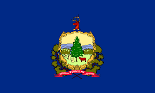
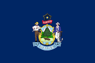
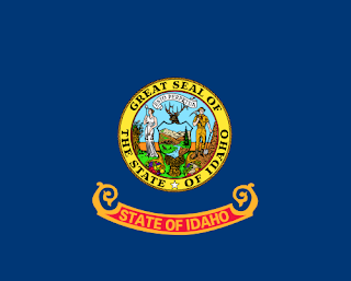
Half the states' flags in the U.S. are super boring. A blue field with the state seal on it. Here's Vermont:
And Maine:
And Idaho:
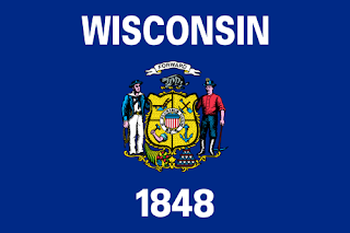
Some of the states realized that making their flags indistinguishable was a stupid way of having a symbol. But instead of creating new, interesting flags, most of the states that had this realization merely added their states' names to the flag, begging the question: why have a symbol at all, when you have to type out the name of the thing that you're supposedly symbolizing. Wisconsin is a good example of this phenomenon:
I'm surprised no one's gone out and just had a blue rectangle with giant block letters that says, "THIS IS THE FLAG OF KENTUCKY":

That would be as symbolic, and as aesthetically pleasing, as what they do now.
BEAUTIFUL
Some subnational flags are truly beautiful. They combine a pleasing palette with a coherent design and composition. Queen Elizabeth II's personal flag in Barbados is one that really struck me:
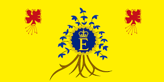
It's just beautiful. I also liked several of Taiwan's counties' flags. Here's Yilan County:

Some of the geometric designs can be very pretty, too. I've always liked Maryland's flag:

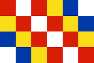
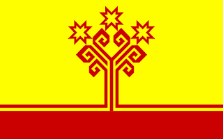
Newer to me were the flags of Antwerp and Chuvashia (in Russia). They're both geometrically shaped, but retain their distinctiveness and attractiveness, too:
SILLY
Not many flags qualify as silly. Usually, you can see what they're going for, and even if they don't quite make it, you just say, "That's not a very well-designed flag." In the case of South Korea's regions, however, all you can say is, "There goes a silly, silly flag." I give you, as People's Exhibit One, the flag of South Gyeongsang:
This is vexillogical inanity at its utmost. It's a bad advertising image, for sure. And if that were all, you could forget it and move on. But they made it their flag! Can you imagine all the little kids in South Gyeongsang starting their day at school? "I pledge allegiance to South Gyeongsang, and the little Es that make some cartoon eyes. And to the random verb, written in English...." Come on, South Gyeongsang, flag designing is serious stuff! Try a little harder next time.
CREEPY
Some subnational flags are a little creepy. There seems to be, for example, a subgenre of flags featuring disembodied heads. I think that's odd and somewhat unsettling. Here's the flag of Penza Oblast (again, in Russia):

Who wants a stylized floating head of Jesus on their flag? Well, Penzans, I guess. It just makes me uncomfortable. And Corsica's flag isn't much better:
Apparently, throughout history they've switched back and forth between blindfolding the head and leaving its eyes open, as it is now. Either way, it's creepy.
The other one that is a little weird is the Isle of Man. Their symbol is three running legs, all connected at the thigh, with no body attached:

If you saw that in real life, you'd be terrified. So why put it on your flag for everyone to see? Well, maybe because the only people who are really going to see it are the 80,000 or so Manx who live there. I think that's part of why the smaller polities tend to have more individual-looking flags - they only have to appeal to a small population.
HUH?
There are a few flags that I came across that really did not make any sense. They obviously signify something, but I'm at a total loss to think of what. Any help with these ones is greatly appreciated.
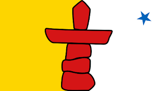
First up is Nunavut, Canada's newest territory. Their flag is slightly asymmetrical and yet visually pleasing to my eye. I liked it when they first came out with it. I just have no idea what it depicts:
And last is the strangest flag I think I've ever come across. It's another Russian oblast (go to the Wikipedia list of Russian flags - they really have some fascinating ones). This one's named Voronezh, and I will pay you money if you can tell me what the heck is happening on this one:

Okay, thus concludes today's journey through subnational flags.

6 comments:
Joe, that last flag is easy. Clearly, their cup knocketh over.
I was LOLing the whole way through the flag discussion. I'm now totally fascinated by creepy and silly flags.
I regret that Colorado and I think Minnesota decided on the logo-on-blue motif. I can't even remember Minnesota's anymore.
Yeah, some sort of cup runneth over off of a big pile of sandbags. It commemorates the region's most popular sport, drink spilling. Every day is a party foul there.
And Nunavut's, I'm guessing, signifies the same sort of pile of rocks as the ones we saw in Winnipeg -- it's a symbol of a human in rock-pile form, which I guess is about friendship or something? I forget what exactly.
Anyway, some great finds on the flags. Don't know how you unearthed Kentucky's original flag design.
I admit there are several states that are a huge disappointment in the flag department, but there are really some pretty cool ones. Alaska's is pretty with the stars, for example. I particularly like Oregon's state flag. At first you see it and are all, "Oregon! That flag is not only just another emblem on a blue flag, but it is the shittiest one in the country and looks like it was made with iron-on patches" but then, bam! There's a beaver on the back?!? What is up with that?
No kidding - a beaver on the BACK of a flag? Now there's some out-of-the-box-and-yet-still-IN-the-box thinking...a 2-sided flag.
Hawaii's kind of funny. It's totally in identity crisis. "Who do we copy? The UK?? All the dull Europen tri-colors?? I know, let's just throw them all together in the US flag pattern and hope no one gets ticked off about which greedy colonizer we honor..."
By the way, Joe, I can only assume the flag of the Russian oblast Yaroslavl is of Misha kolsolapi, the pigeon-toed bear. I'd write it in Cyrillic, but not only do I not remember much of the Cyrillic alphabet, I couldn't even remember how to spell Cyrillic and I had to look it up.
Long live PECTOPAH, the easiest Russian word!
I consider the Hawaiian flag a big "fuck you" to America. So they become a state of the U.S., and they leave the flag of our former overloads on their flag, as if they were a commonwealth country? That's like if John Lackey joined the Red Sox and wore a Yankees hat in every game. I say we conquer them. Even more than we already have. Let's take over all their land and distribute it among the real Americans. (Also, I want a vacation home in Hawaii.)
And you have to like the Alaskan flag because it was designed by a 13-year-old named Bennie Benson. Ergo, if you don't like it, you're an asshole. True story: http://www.50states.com/flag/akflag.htm
Post a Comment